CLEARINGS
Client: Clearings
Sector: Real Estate
Role: Designer
Agency: Conran Design Group – HAVAS
Personal Responsibility: Brochure / Visual Identity / Photoshoot / Hoarding
Selling the dream. Clearings, one of the last remaining iconic developments in the heart of London, wanted a premium identity and sophisticated brochure to create and attract interest; and to help secure funding in their scheme prior to planning approval.
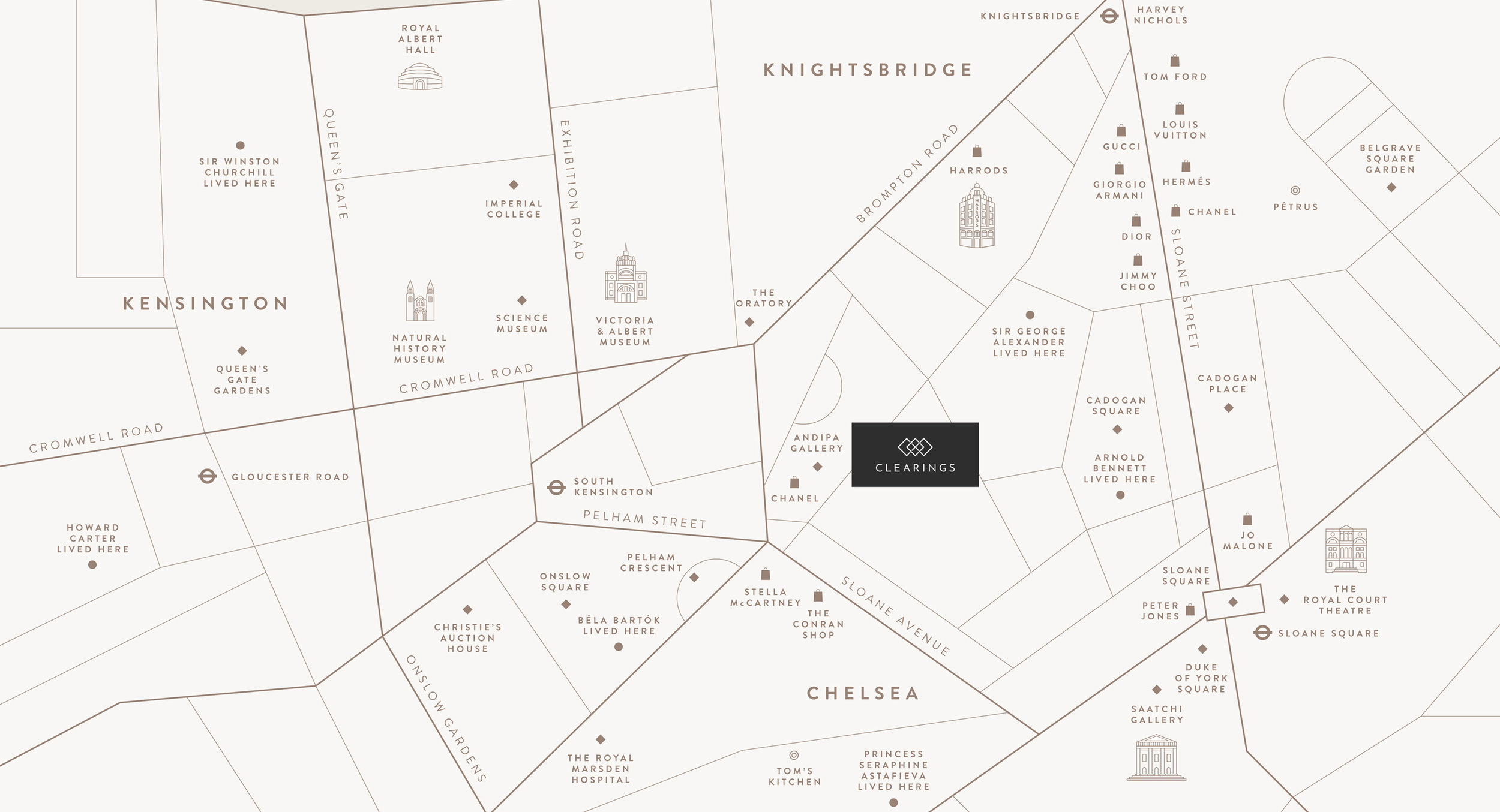
The identity needed to be elegant with stature and be on par with other prime developments in the capital. We looked to represent the architectural ‘promise’ and potential of living at the axis of three prestigious neighbourhoods.


The development is made up of three buildings, and located at the pivotal intersection of three of London’s most desirable areas. We played with the power of three by dividing the brochure into three sections, representing the living potential, the architectural promise, and the beauty of the finer detail. To establish a new section we placed short pages between two dramatic, juxtaposed images. The paper stocks also varied to enhance the experience.
We shot on location around London’s Royal Borough, capturing the understated opulence and grandeur of Knightsbridge, the artistic brilliance and sophisticated fashion of Chelsea, and the cultural buzz of Kensington.


We created two editions of the brochure over consecutive years. The first was weighted towards selling the location and the lifestyle. The second edition was focused towards the building and the architecture.


