


Client: du, EITC
Sector: Telecommunications
Role: Creative Lead
Agency: Start Design | Kinetic Brands
Personal Responsibility:
du Consumer – Full Identity Rebrand / Guidelines / Brand Collateral / 5G Identity / Motion / 3D Animation Direction / Strategy Involvement / Digital Reskin / Social Media / Environmental Branding / Retail Branding
du Business – Full Identity Rebrand / Guidelines / Brand Collateral
Awards:
Transform Awards MEA 2020: Best Creative Strategy – Silver
Transform Awards MEA 2020: Best Brand Evolution – Highly Commended
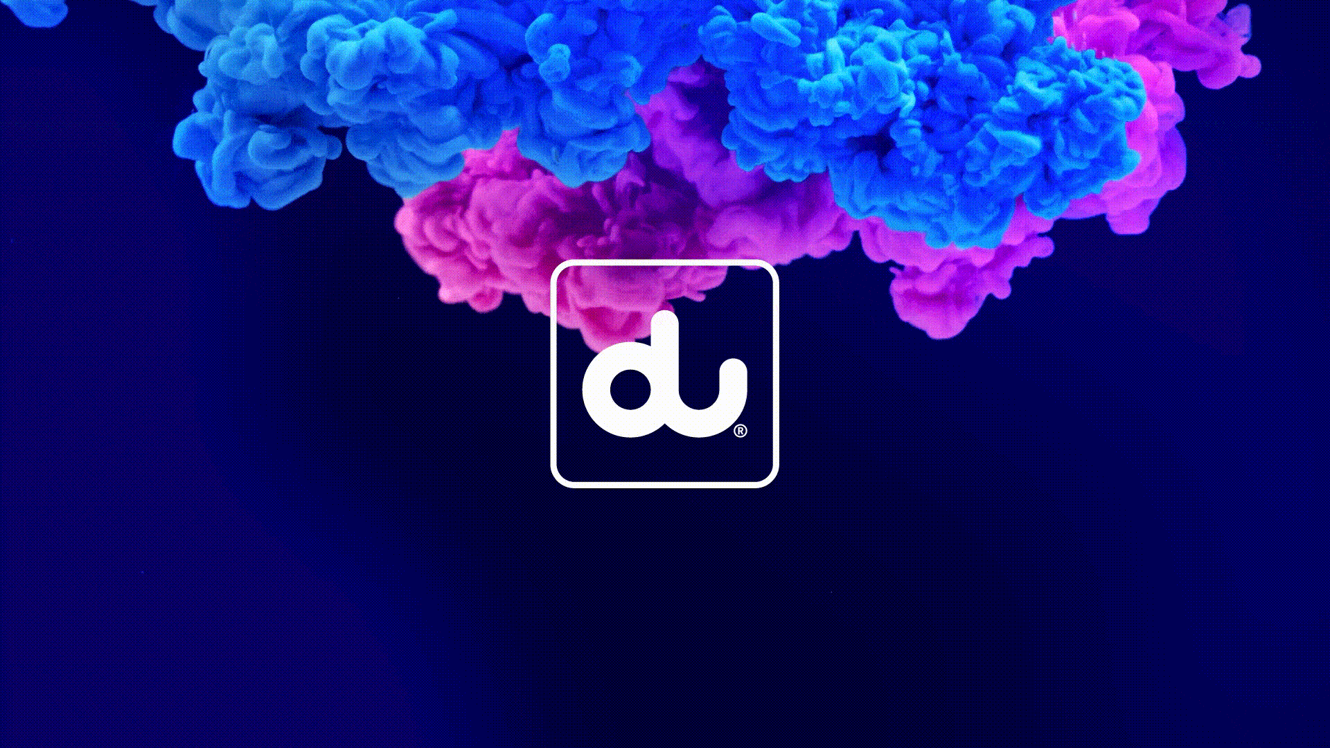
Launched in 2007, du is one of the UAE’s biggest Telco giants. Founded in a print-based time, the brand had not kept up with the increasingly dynamic digital interactions of today’s world. It needed an injection of life, revitalising its channels with a digital first approach, enhancing its relevance to a modern consumer audience.
Refreshing du for an ever-changing digital world –
Each visual element was reconsidered for how it could bring life and enhance energy, a visual interpretation of du’s tagline: ‘Add life to life’. The meaning shifted from what the brand would give to the consumer, to being a statement of enablement, providing consumers with the tools to ‘add life’ to their own life.
A mobile and digital-first approach, striving to move the brand wherever possible. Brand animations were created for store fronts and digital platforms to entice audiences into a world of connectivity. A responsive window device was developed to create a fluid graphic system. Long headlines were swapped out for short fast-paced messaging, capturing attention in today’s non-stop world. Solid colours were replaced with vibrant shifting gradients, creating a palette of transitioning colour. Dramatic photography powered the notion of ‘always on’ – always here, always something new.